top of page

Fullstack Academy -
Website Redesign
Overview
My summer project was to redesign, rebrand and develop a new information architecture for Fullstack's website which had no major update since the website was first launched in 2012
Duration
Role
Team
Tools
10 weeks
(June- Sept. 2020)
UX Research,
UX/UI Design
Disha Vanzara,
Kelly - Brand manager
Nimit - Founder
Figma
Redesigned Fullstack's website so that prospective students are better informed of Fullstack’s programs


Process
Discover
Define
Ideate
Prototype
Deliver
Understand the coding education industry
Evaluate the changes needed
Developing a solution
Testing wireframes and iterating on the designs
Final Solution
--- PROBLEM STATEMENT
How might we redesign and rebrand the website so that prospective students feel Fullstack is the right place for them ?

Phase 1
DISCOVER
Problems with Current Website
1
2
Over time the website has become fragmented and there is a lack of consistent design expression through the various webpages
Fullstack is one of the best coding academies in the world and also has a strong women's only academy (GraceHopper) both these facts are not being well-publicized or marketed


--- RESEARCH QUESTION
What are the motivations for prospective students to join a coding academy ?
----- KEY INSIGHTS
People who are joining a coding academy are looking to switch jobs into coding
-
Prospective students are likely quitting their job to pursue a bootcamp and they want to know how long the commitment is (Full time / Part time)
-
Where the course is offered is important (Certainly pre - pandemic)
-
Fully understanding the different course offerings and assessing the right fit
Outcomes matter and students want to know how well the academy has performed
-
Prospective students want to know how well the academy's alumni have done
-
The academy culture and instruction quality are important factors
-
A dedicated career service team is assuring
--- ANALYSIS
State of Fullstack's website today
Phase 2
DEFINE
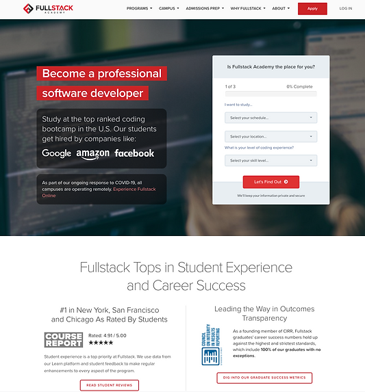
Current home page observations
The form present on the landing page is helpful for lead generation
Big company names like Google, where Fullstack students have landed jobs gives the program credibility
Having student reviews and alumni success metric on the landing view assures the prospective students of a bright future with Fullstack
As seen in summer 2020 :
http://web.archive.org/web/20200601024024/https://www.fullstackacademy.com/
Looking at other coding websites
-
The following analysis reviewed other coding academies' home page (since its the most important page) and how they presented themselves

General Assembly
Key points:
-
In one glance, the prospective student notices the courses available with all details summarized together
-
The amount of commitment (part-time/full time) is clearly emphasized for those who are concerned about the time they would be giving to their course
-
Course financing options are provided on the home page

App Academy :
Key points:
-
The home page is concise and to the point (user spends less time scrolling)
-
Clearly showcases the performance statistics that highlight how good the academy is
--- LEARNINGS
How does Fullstack's website do with addressing the needs of prospective students ?

Phase 3
IDEATE
To get a higher level view it was important to understand the site structure and that's why I generated a simple site map of Fullstacks website
----- KEY INSIGHTS

1. Hard to find Course descriptions
When the user lands on the homepage, they find it difficult to find courses and the details at a first glance, instead having to go through multiple menus and clicks to find them
For clear visibility to the user there needs to be the option to view syllabus and the course contents on the home page
2. Home page body is long and dense
This confuses users and makes it difficult to navigate to different sections of the website. There are many topics that are scattered on the Home page and it makes it challenging to the user to select what is important that they should read.
Home page landing view could be more interactive and engaging e.g adding a marketing video


3. The menu items are not categorized well
There are many options that can be consolidated allowing the users to discover and find the right content quickly
-
The Campus and Programs can be combined because they are part of course details
-
The About us section can be combined with Why Fullstack ?
Having unique program offerings like Grace Hopper and important topics like Program funding also must be present on the home page
After research I defined the design goals
UX Goals
-
Enable students to identify the right program
-
Show how Fullstack delivers positive outcomes
-
Emphasize Fullstack's unique aspects
UI Goals
-
Creating a brand kit that enables consistency and provides for a unique identity
-
Visually appealing website to attract more students
-
Defining a new Information Architecture
--- ITERATIONS
The next steps were to develop wireframes and prototypes for iteration based on user feedback
Phase 4
PROTOTYPE
Cycle of iterations and testings
On presenting the redesign opportunities, I was given feedback by the branding team to first focus on the home page as that would be the most critical page for a first impression

Landing view was similar to Fullstack's current website. I added a table of courses but realized that it was too much information being thrown at once to the visitor

The courses have been listed in a systematic and more visually appealing manner. The overall UI is now well structured with page breaks. Despite this the home page is still dense with a need to add more white space

Incorporated all the feedback, there is a good balance between information and space
--- SOLUTION
Final steps for collecting the user feedback and making final iterations
Phase 5
DELIVER
Final Web Pages
Home Page

About Page

Course Page

bottom of page